This Part of my case study will closely analyse the publishing company IPC.
IPC is a world wide, exclusive publishing company and has been in business from 1963 following the merge of the UK’s three largest magazine publishers George Newnens, Odhams Press and Fleetway publications. They eventually came together to form the International Publishing cooperation (IPC). Following the formation, IPC magazines were then formed 5 years later in 1968. IPC magazine covers many fields of interest making the company a huge success in the UK. Statistics show that “almost two in every three UK women and over 44% of UK men read an IPC magazine”. “That's over 26 million UK adults”.
IPC is currently owned by Time Inc, which is the publishing division of the Time Warner Inc. The company says: “Our business is split into five distinct publishing divisions: IPC Connect, IPC Inspire, IPC Ignite, IPC Southbank and IPC TX. Alongside these is Market force, the UK's leading magazine distribution business”
IPC employs over 2,200 people of all backgrounds. Their creativity, drive and ambition are what make the company very successful in UK consumer publishing.
The company supplies about 80 different magazines to the general public. They include: What's on TV, Pick Me Up, Woman, Now, Marie Claire, In Style, Woman & Home, Ideal Home, Nuts, Wallpaper*, Country Life, The Field, Rugby World, Practical Boat Owner and Look, as well as many other magazines throughout many years of publishing. IPC also supplies NME; the first major music magazine which has its own website.
Through many years, the company has certainly excelled. From the 1800s where they first launched ‘The Field’, the largest newspaper in Europe with 25 pages to the magazines of the modern day like Look and Pick me up. Time Inc has also provided IPC Media with £1.15 billion in October 2001, making it the biggest magazine deal ever experiences in the UK, and also the biggest transatlantic media deal of our time.
IPC magazines have a very large target audience due to the many different styles of magazines they publish. In terms of gender, the magazines appeal from young men to older men. For example IPC publishes 'Nuts', target audience being for a younger generation due to the content of the magazine; women, cars and football. For older men, there are such magazines like 'GOLF' and 'Decanter'. There are also magazines like 'Woman & Home' for older female consumers.
In terms of Age, the magazine also appeals to a wide number of people of many ages. For example the magazine 'Marie Claire', 'NME' and 'In Style' may appeal to younger consumers rather then a consumer at an age of 50 or above.
However, one type of magazine that the company doesn’t provide is religious magazines. Perhaps, because there is too much of a wide field of religious views its harder to publish one type of magazine without offending another.
The prices of these magazines also show variation. Some magazines are more expensive then other. For example, Marie Claire sells its magazines for about £3.30 whilst Nuts sells its magazines for £1.60. The prices seem to vary on how often it published; every month or every week. Monthly magazines prove to be more expensive then weekly magazines.
In terms of special interests, the magazines IPC provides cover pretty much everything some could like. From music to home life the IPC magazines show a variety of fields of interest that people may have. This is why the company is very successful and makes a large amount of money due to purposely reaching out to a wider target audience.
Saturday, 24 January 2009


Thursday, 22 January 2009


Tuesday, 20 January 2009
Analysis Of a Double spread Music Magazine

Denotation: This shows a double spread of this music magazine ‘XXL’, showing three men behind bars wearing inmate clothes. Two of the men are holding onto the bars whilst the other man on the left is placing his hands on his chest. What seems to be like a drawing of the men instead of a photograph is taking the whole space of the double spread making it the first image you notice. The drawing of the men seems to be like a mid shot eventhough their legs are harder to see. In front of them, the next large image the readers can see is ‘STRAIGHT PATH’ as well as other typography. The second half to the double spread shows very long paragraphs and also different artist’s names who are in prison and then later followed by dots show in which the year they went to prison. At the very bottom of the first page shows who the articles were written by, the magazine it’s from and the month and year in which it was published.
The connotation of the drawing shows how serious the men are. Their image of being in prison is also highlighted through their facial expressions. They are not smiling and happy, reflecting the environment in which they live under. Therefore, this makes the double spread page about incarcerated MCs more realistic and makes the audience more interested to read it.
Although this is not a photograph of the inmates, the first page of the double spread page shows what the next few pages will be about due to the two lines showing ‘REAL I.D..’ This part is slightly larger then the first three lines ‘The list..’ and is in capital letters to again connote seriousness. The shot sentences shows what they are writing about is really ‘NO JOKE’
The font of the writing also looks like bars going down the writing linking to the theme of the double spread being about locked up MCs. The font also adds diversity to the double spread, again making it look real. All the typography is in white apart from the mail title ‘STRAIGHT PATH’ which is in a dirty green colour. The double spread has a very lonely and isolated feel to it. It looks very dull and shows low key tones of lighting.
On the second page of the double spread then opens up into the article explaining the track record of celebrities behind bars for numerous numbers of things. The paragraph is long again connoting seriousness because it is not all over the place. It is straight forward and to the point. It starts of with a capital ‘T’ again in the same font as the first page of the double spread.
The setting is obvious, it being in prison. The audience can tell because of the clothes the men are wearing. All of the men are wearing the same uniform in the same colour although the third man from the right looks lighter. This shows that the target audience may be for an older category of men or boys because we can immediately connote masculinity through the painting/ drawing. It shows that in prison everyone is pretty much treated the same, given the same clothes to wear, no one has their identity there like they would if they were in the out side world.
The double spread closely looks at gang culture and the reasons in which the artist went to prison. The target audience therefore even may be for younger audience to some how warn them of the affects of committing a crime
Saturday, 17 January 2009
Music Magazine-Questionnaire Results


Demographical Profile:
Sex:From the results of my questionnaire I can conclude that the gender of which my magazine would appeal to the most is females because more females took the questionnaire.
Age; 16 years or older although, the results show that more students don't actually buy music magazines because of 'other' reasons
Race; Any ethnic minority although more black British females and males took my questionnaire. I will therefore mainly focus on Black music culture due to the most ticked answers for the question 'What type of music do you listen to' being 'Hip Hop & R&B'. I will also highlight another aspect of music through the eyes of a different artist/band to make my magazine more appealing to many people who may like, for example: Rock and Hip Hop.
Religion; My results show that most students are catholic or christian. This could be due to the nature of the college in which the students go to as it is a Catholic college. I think that religion is more varied, and therefore it would be harder to reach across to a wider Target audience that follows many type of religions. It would be interesting if I could highlight religion through music and the artist shown in my music magazine.Perhaps I could focus on the religions that are not as 'common' as Christianity.
Income; As most people taking the questionnaire are students in full time education and herefore do not work, they don't receive enough money to buy a music magazine every time it is issued.
Income; As most people taking the questionnaire are students in full time education and herefore do not work, they don't receive enough money to buy a music magazine every time it is issued.
Special interests; More young people prefer to read about fashion and trend in comparison to how much they want to know about other types of music. This will help me to understand what the magazine should promote in order for the magazines potential buyers to purchase my music magazine.
Wednesday, 7 January 2009
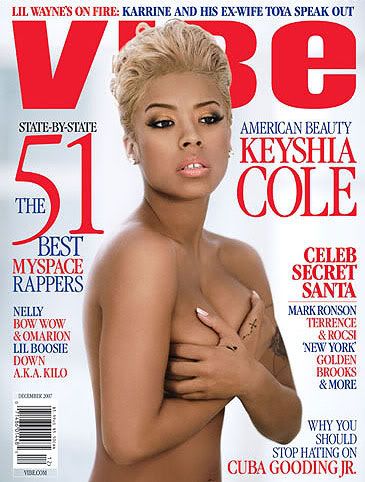
Textual Analysis Of a Music Magazine Front Cover

Denotation: The Music magazine cover shows a woman posing, which seems to be in nude even though we cannot see the bottom half to the photograph. Her hands are placed over her chest to cover her breasts. This photograph is a mid shot which only shows the neck, shoulders and just above the waist. The photograph is symmetrical, placed in the middle of the magazine to attract the reader’s attention. The background is a gray/white colour that covers the whole of the magazine.
Behind the women is the ‘VIBE’ cover line, and around her are 5 different cover lines in red and blue. The women’s name is on the top right hand in red and each cover line has spaces in between them. A bar code is also visible on the bottom left hand corner.
Masthead: The vibe masthead is very bold and stands out, even though it is behind the cover image. It is in red, san serif font and each letter is roughly separate from each other which also make it stand out even more. Issued monthly, the Vibe magazine's target audience is mostly young, urban followers of hip-hop culture. The name of the magazine connotes youth and links to the hip pop culture the magazine promotes. Founded by Quincy Jones in 1993, the magazine mostly covers news on music artists, actors and other entertainers. Because of the urban culture the magazine issues; it attracts younger readers of many ethnicities.
The first cover line on the top of the masthead is in a serif font. The first four words “Lil Wayne’s on fire:” is in red, standing out on top of the masthead and indicating the topic, then follows the story the magazine will be covering. This is shown in blue. The cover line informs the readers of the famous rappers Lil Wayne’s ex wife’s side of the story and his current relationship with ‘Karrine’. The red connotes passion, or even danger which links the artist being “on fire”, metaphorically meaning his career is a great success to him and to others.
The second cover line placed on the right hand side reading ‘American beauty’ is in blue then follows in a bigger size font. ‘Keyshia Cole’ who is the women posing in the middle of the magazine connotes not only ‘American beauty’ but Black American beauty as the magazine is dominated mostly by black American Music artists and actors.
The third cover line, again in red, which seems to be bolder then the rest of the cover lines, reads ‘Celeb secret Santa’ which links to the theme of Christmas, as the magazine was published in December 2007. It then has a line under it with a list of celebrities. First ‘Mark Ronson’ who is a British music producer/artist, ‘Terrence & Rocsi’ an American duo who hosted a show called ‘106 and park’, “New York” a reality TV show gimmick and ‘Golden brooks’ an actress from show called ‘Girlfriends’
The fourth cover line in blue placed on the bottom of the magazine is not typed in a bold blue font. Under that, in red is ‘Cuba Gooding JR.’ who is a famous actor in America. This is bigger then the cover line it self.
The final cover line is the longest cover line taking the space between the masthead and the bar code. The ‘51’ is the largest, in red as well as ‘MySpace’. The magazine covers the best 51 MySpace rappers in 51 states in and out of America. Just above the ‘51’ is the only writing in black reading ‘state-by-state’ suggesting the scale in how they found the best rappers. It then follows on by adding what seem to be the top American rappers ‘ Nelly’, ‘Bow wow and Omarion’ ‘ Lil Boosie’ ; Down A.K.A Kilo’. The layout of the cover line is also similar to the cover line opposite because of the blue before red pattern.
All of the cover lines are in serif font connoting tradition. They also show a strong emphasis on American artists and actors although there is a mention of one British music artist.
The cover photograph of keyshia Cole is placed in the middle, to obviously get the readers attention. The target audience for this magazine cover would probably be more for young men and older men. Keyshia is posing in a very seductive way. Her lips are slightly opened, and she seems to be naked, covering her chest with her hands. This is therefore very sexually suggestive. It is obvious that this was carefully thought of to suit the target audience. Most cover images of female celebrities for the Vibe magazine wear few clothes. Keyshia is however, wearing make –up. She is wearing a light shade of gold eye shadow and eye liner and mascara. The lipstick on her seems to be a light pink colour. This also links to the ‘American beauty’ as she looks very simple and attractive. She is also wearing small stud earrings. Nothing in the photograph looks like she is trying too hard. Again, being very simple. There are no props in the photograph. The photograph shows high key tones of lighting and was definitely taken in a studio due to the background of the photograph.
Subscribe to:
Comments (Atom)